It’s
January, that means winter is here and the last year’s same time is in
sight. Now, it’s time to look at some web design trends of 2015 which
had been staying power in 2015. So let’s get into it.
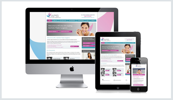
Responsive Design Strategy
Over the last few years, responsive design
has stood out as the new standard for web design in general and
WordPress themes in particular. It’s obvious that, there are still
arguments over implementation, but no one saying, ‘let’s get rid of it’.
And in fact, there are more and more sites opting to go in that
direction.
Ghost Buttons
Well,
ghost buttons are the prominent design features and even flagship theme
across the glob. It’s easy to know why. One simple answer to your
question is that they are transparent, stylish, minimal and with the
slight hover animation! Even they are bordered with a very thin line and
contain light sans serif fonts. If you are looking for this trend, then
you should consider large background images and videos to suit this
pattern well. Remember one important thing that ghost buttons are not
meant to distract you, just appeal your attention in a delicate way.
Put More Emphasis on Typography
In
fact, traditional web type kits allow beautiful fonts and typefaces to
be employed on the website; but they are quite expensive. That means,
the traditional typography designs require larger budgets; which
generally leaves small guys out of the fun! But now the time has
changed, as the type kits are reasonable (or free in case of Google
Fonts). As a result, it will be great for the designers who are working
with a smaller budget in order to get their typography knowledge to the
typography table. In addition to, it can allow the WordPress theme
designers to take more typography flexibility in their themes as well as
creating stylish designs with a stunningly designed WordPress theme.
Large, Striking Background Videos and Images
One
of the simplest ways to make your website stand out in the huge
competition is by adding excellent content displayed significantly. By
adding large, beautiful images and videos, you can accomplish the brand
existence. Remember one important thing that when you will use larger
design in the theme, it will look like more powerful and elegant.
Scrolling Over Clicking
As
the mobile website continues to emerge and web design continues to go
in the direction of more effective and enjoyable mobile experience,
scrolling can easily dominate over the clicking procedure. It’s more
spontaneous and easy to do, which allows more dynamic interactions
between the user and the website.
As
scrolling through the web pages are quicker than clicking, so it can
easily convey a wide array of information with slowing down the user
experience. Due to its mobile and touch friendly nature, it can be a
perfect choice for web pages where the storytelling is must!
In Conclusion
If,
you have any thought or idea on the web design concepts in 2015 or do
you want to follow this concept, please feel free to share your thoughts
in the comment box below!
0 comments:
Post a Comment